Building a scalable design system for a growing SaaS platform

Role

UI/UX design

Team

UX designer and Product Manager

Tools

Figma

Overview

Optimy is a SaaS platform that helps organizations manage their grant, volunteer, donation, and sponsorship programs.

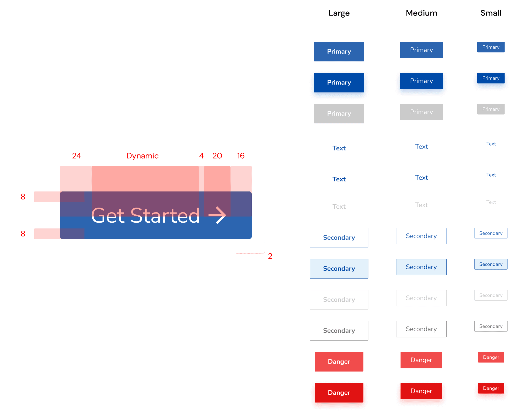
As the product and team scaled, I led the creation of Optimy’s first Design System — a project that improved collaboration across teams, reduced redundant meetings, and enabled more efficient and consistent product development.

Problem

Without a Design System in place, maintaining consistency across Optimy’s growing ecosystem became unsustainable:

  • Designers and developers relied on constant syncs to align on patterns and components.

  • The absence of clear guidelines led to design inconsistencies and duplicated effort.

  • There was no documented source of truth for UI decisions, increasing friction and slowing down the creation of new features.

With limited resources and no existing branding guidelines, we needed to build a system that was simple, scalable, and easy to maintain — and that could immediately help cross-functional teams collaborate more effectively.

Outcome

  • Reduced redundant meetings between design, development, and marketing teams.

  • Increased design and development efficiency by enabling faster component reuse and alignment.

  • Accelerated the delivery of new features by providing a shared language and well-documented components.

  • Laid a scalable foundation for future growth and ensured consistency across the platform.

Context

Optimy’s product team was growing, and more modules were being integrated into the platform. Without a Design System, cross-team alignment relied heavily on meetings and repeated conversations. Designers and developers had to re-discuss design decisions repeatedly to maintain consistency, which slowed down the process and made scaling the product increasingly difficult.

I was brought in as a UX/UI Designer to help establish a cohesive design language and system that would support both the current platform and future expansion.


Design Challenges

  • No existing branding guidelines: I collaborated with the junior UX designer to create a full brand book as the foundation for our system.

  • With only two designers, it was essential to maintain constant alignment and clear documentation for others to follow.

  • Thorough documentation was time-consuming but necessary to ensure adoption and clarity across teams.

Goal

Create a clear and flexible Design System to:

  • Promote consistency across the platform

  • Reduce time spent on alignment and redundant design work

  • Enable designers and developers — even those new to the project — to quickly understand and apply design patterns

  • Improve accessibility across all components

Research

We took inspiration from Brad Frost’s atomic design methodology, which allowed us to structure the system from the smallest elements (atoms) up to complex templates.

I conducted a full audit of the existing UI and categorized components as:

  • Atoms → typography, color, spacing, inputs, buttons

  • Molecules → form groups, input + label combinations, etc.

  • Organisms → complex components (cards, tables, modals)

  • Templates → page-level layouts

Building the system

I defined a generic structure upon which we would build the system, essentially breaking down all elements into their most atomic form. Most importantly, the most common elements, like typography styles, colors, inputs, and buttons, would be detached from any specific context.

No branding guidelines were given, so in collaboration with the junior UX designer, we created a branding book with guidelines including a color palette, typography, and guidelines for specific situations when applied. The branding guidelines served as a foundation for building the design system.

Documentation

As a complete workplace solution, we documented the guidelines and specifications in a Notion workspace for better collaboration directly with our design team and other stakeholders (development and marketing). We made sure to incorporate our design principles, guidelines, accessibility standards, and best practices for creating and testing the following designs.

Outcome

  • Reduced redundant meetings between design, development, and marketing teams.

  • Increased design and development efficiency by enabling faster component reuse and alignment.

  • Accelerated the delivery of new features by providing a shared language and well-documented components.

  • Laid a scalable foundation for future growth and ensured consistency across the platform.

Learnings

Next time I’d approach a project like this, I would get buy-in from higher management and the development team to:

  • Ensure our design system is fully integrated into code, which is key for its effectiveness and evolution.

  • Collaborate with someone on the other team who is as invested as I am.

Securing this support is crucial for the design system’s enduring success because we’d have a clear strategic direction and the necessary resources. Collaboration with developers would ensure the system’s technical viability, keeping it effective and relevant over time.

Latest projects

Other projects

Some of my
other stuff

Create a free website with Framer, the website builder loved by startups, designers and agencies.