Reducing cart abandonment in a B2B marketplace checkout

Role

Product Designer

Team

Developers, CEO and Me

Tools

Figma

Overview

Meetoptics is a B2B marketplace that allows engineers and procurement specialists to compare and purchase photonics products from multiple suppliers.

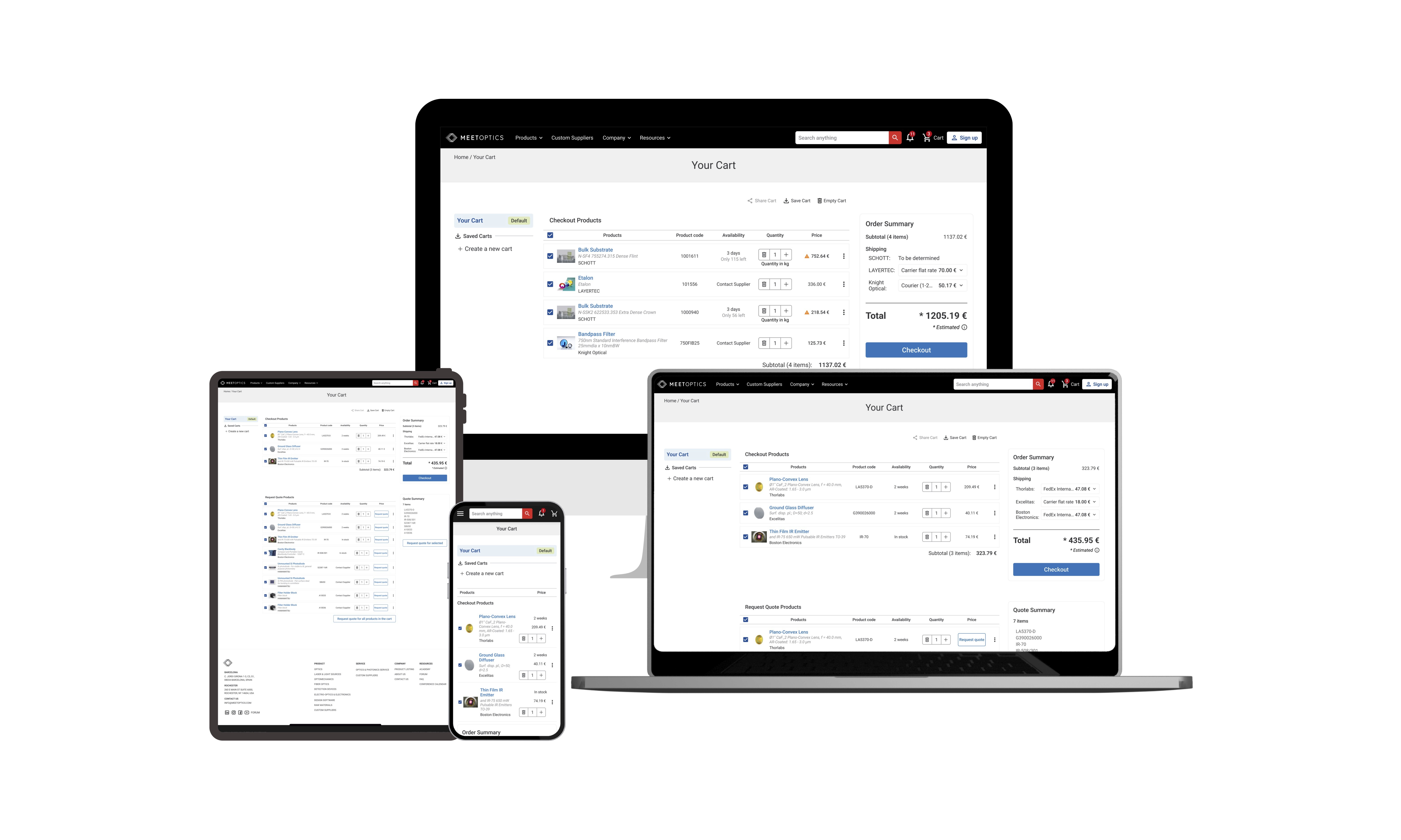
I worked on improving the platform’s checkout experience by refining the flow of the new One Click Payment feature — aimed at enabling seamless purchases across suppliers.

My role was to enhance clarity, usability, and accessibility of the checkout flow while aligning the design with our design system and technical constraints to ensure faster development and higher reusability across the platform.

Problem

The platform had recently introduced a new cart structure that separated purchase-ready and Request For Quote (RFQ) items, but usability testing and internal feedback showed it was not yet clear to users.

The checkout flow itself also lacked a proper step-based structure, which created confusion and friction, leading to:

  • Increased dropoff rates at checkout

  • Low conversion of both purchases and RFQs

  • Higher operational overhead, since the internal team had to manage orders manually

From a business perspective, improving this flow was a priority to:

  • Increase completed purchases and RFQ submissions

  • Build trust and transparency with procurement users

  • Reduce support requests and manual follow-up work

Outcome

Before launch, I led a usability test with target users to validate the improved flow:

  • 100% task success in completing the purchase-ready flow

  • Users clearly understood the separation between purchase-ready and RFQ items

  • Increased trust in proceeding with checkout

  • Identified copy and interaction improvements that were incorporated into the final prototype

Unfortunately, due to company-wide budget cuts, I was laid off before this feature was implemented, so the final business impact is yet to be measured. However, the validated improvements and detailed handoff provided the team with a ready-to-build solution.

Context

I joined the project after the initial checkout redesign had been created by a previous designer. The basic structure — separating purchase-ready and RFQ items in the cart — was already in place, but testing and internal feedback showed it still caused confusion.

Additionally:

  • The checkout UI was inconsistent with other purchase flows on the platform.

  • Developers needed to reuse existing components to reduce implementation effort and ensure maintainability.

  • The person manually processing orders needed clear, accurate information coming from the flow to process payments and invoices correctly via Odoo.

Design Challenges

I focused on solving several key challenges:

  • Clarify the two cart sections (purchase-ready vs RFQ), both visually and through copy

  • Align the checkout flow with existing platform patterns and reusable components (Design System alignment)

  • Introduce a clear step-based flow to guide users through checkout, helping reduce cognitive overload and decision paralysis, which are major drivers of cart abandonment.

  • Reduce known friction points previously identified

  • Improve accessibility to ensure the flow was usable for all users

Why the original cart caused confusion

Unclear visual separation
The layout didn’t make it obvious which items were for purchase and which were for quote.

Shared total for mixed item types
The pricing summary combined all items, which led to uncertainty about what users were actually paying for.

Unclear call-to-actions
Actions like “Checkout & Request Quote” didn’t clearly explain what would happen next.

No guidance for quote-only items
Users weren’t informed why some products couldn’t be purchased, adding frustration and drop-off risk.

Solution

1. Improving clarity of cart sections

I redesigned the cart page hierarchy, labels, and explanatory copy to make it explicit which items could be purchased immediately and which required an RFQ.

3. Adapting the flow to supplier-specific exceptions

Some suppliers had unique requirements such as: minimum order amounts, restrictions on who handles shipping, quote-only conditions for low-value items.

These constraints meant users couldn’t always proceed through the standard flow. To address this, I designed supplier-aware UI elements that dynamically adapted based on the products in the cart. This included:

  • Surface-level warnings for minimum order limits

  • Adjusted call-to-actions for RFQs vs checkout

  • Notes and summaries that updated based on supplier logic

The goal was to maintain user trust and clarity, even when business logic behind the scenes added complexity.

2. Step-based checkout flow

I redesigned the checkout experience to follow a clear, guided path — helping users feel more in control and reducing decision fatigue. The flow was divided into two distinct paths depending on the type of item in the cart:
purchase-ready products followed a standard checkout, while RFQ items led to a quote submission flow.

For purchase-ready items, I introduced a multi-step checkout process:

  1. Review cart

  2. Enter billing and shipping information

  3. Select shipping option

  4. Choose payment method

  5. Order confirmation

This structure helped users understand where they were in the process and what to expect next, especially when handling mixed carts with different behaviors.

Usability Testing

I conducted a remote usability test with 6 target users (engineers and procurement managers). The sessions focused on key tasks: adding products from multiple suppliers, completing the checkout process, and understanding how RFQs were handled.

Going into testing, I assumed the separation between purchase-ready and RFQ items was clear. But as users navigated the flow, I noticed they often struggled to understand which summary section belonged to which type of item. That moment made me realize clarity isn’t just about visual layout — it’s about how users mentally organize and follow the information they see.

Key outcomes:

  • All users successfully completed the purchase flow

  • Most users understood the difference between purchase and RFQ items

  • Increased confidence in the checkout process

  • Identified unclear RFQ messaging and improved copy for quote status

  • Validated that the flow aligned with internal order handling processes

Outcome

Before launch, I led a usability test with target users to validate the improved flow:

  • 100% task success in completing the purchase-ready flow

  • Users clearly understood the separation between purchase-ready and RFQ items

  • Increased trust in proceeding with checkout

  • Identified copy and interaction improvements that were incorporated into the final prototype

Unfortunately, due to company-wide budget cuts, I was laid off before this feature was implemented, so the final business impact is yet to be measured. However, the validated improvements and detailed handoff provided the team with a ready-to-build solution.

Next Steps

This project emphasized clear communication in B2B checkout flows, aligning UX with technical and business constraints, and testing early to build trust through user feedback.

To confirm the impact, I would have run A/B tests and tracked key metrics such as time to purchase, checkout completion, drop-off points, and support tickets related to cart issues. These would help determine whether the redesign effectively reduced friction and supported more transparent decision-making across both quoting and purchasing paths.

Latest projects

Other projects

Some of my
other stuff

Create a free website with Framer, the website builder loved by startups, designers and agencies.